What does your LinkedIn network really look like? I visualized my own connections using NetworkX and Plotly, turning a list of names into a living, breathing graph. Along the way, I explored concepts from network and graph theory—like centrality, clusters, and bridges—that reveal hidden patterns in how people are connected. Dive in to see how data visualization can turn something familiar into something surprisingly insightful.
## Installing Libraries

import numpy as np
import pandas as pd
import networkx as nx
from pyvis import network as net
import janitor

import plotly.express as px
%matplotlib inline
import matplotlib.pyplot as plt
import seaborn as sns
from IPython.core.display import display, HTML
## Loading dataset
df = pd.read_csv('data/Connections.csv',skiprows=2)
df.info() # summary info
<class 'pandas.core.frame.DataFrame'>
RangeIndex: 400 entries, 0 to 399
Data columns (total 6 columns):
 #   Column         Non-Null Count  Dtype
---  ------         --------------  -----
 0   First Name     397 non-null    object
 1   Last Name      397 non-null    object
 2   Email Address  7 non-null      object
 3   Company        390 non-null    object
 4   Position       390 non-null    object
 5   Connected On   400 non-null    object
dtypes: object(6)
memory usage: 18.9+ KB
At a quick glance, I have about 400 connections.
Data Cleaning
I will perform some cleaning, remove unnecessary attributes and remove null values from the data.
new_df = (
        df.clean_names() # remove spacing and capitalisation
        .drop(columns=['first_name','last_name','email_address']) # dropped first, last and email
        .dropna(subset=['company','position']) # remove null values in company and position
        .to_datetime('connected_on', format='%d %b %Y') # convert date column to datetime object
)
new_df.head()
|
company |
position |
connected_on |
| 0 |
InfoCepts |
Talent Acquisition Lead |
2021-11-28 |
| 1 |
Yara International |
Associate data engineer |
2021-11-27 |
| 2 |
Yara International |
Lead Recruiter, Digital Ag Solutions |
2021-11-25 |
| 3 |
Yara International |
Data Scientist |
2021-11-25 |
| 4 |
Yara International |
Associate Digital Information Specialist |
2021-11-25 |
Data Exploration
- Connnections at a glance
- New connections over time
- Top 15 companies my connections work at
- Top 15 roles my connections work as
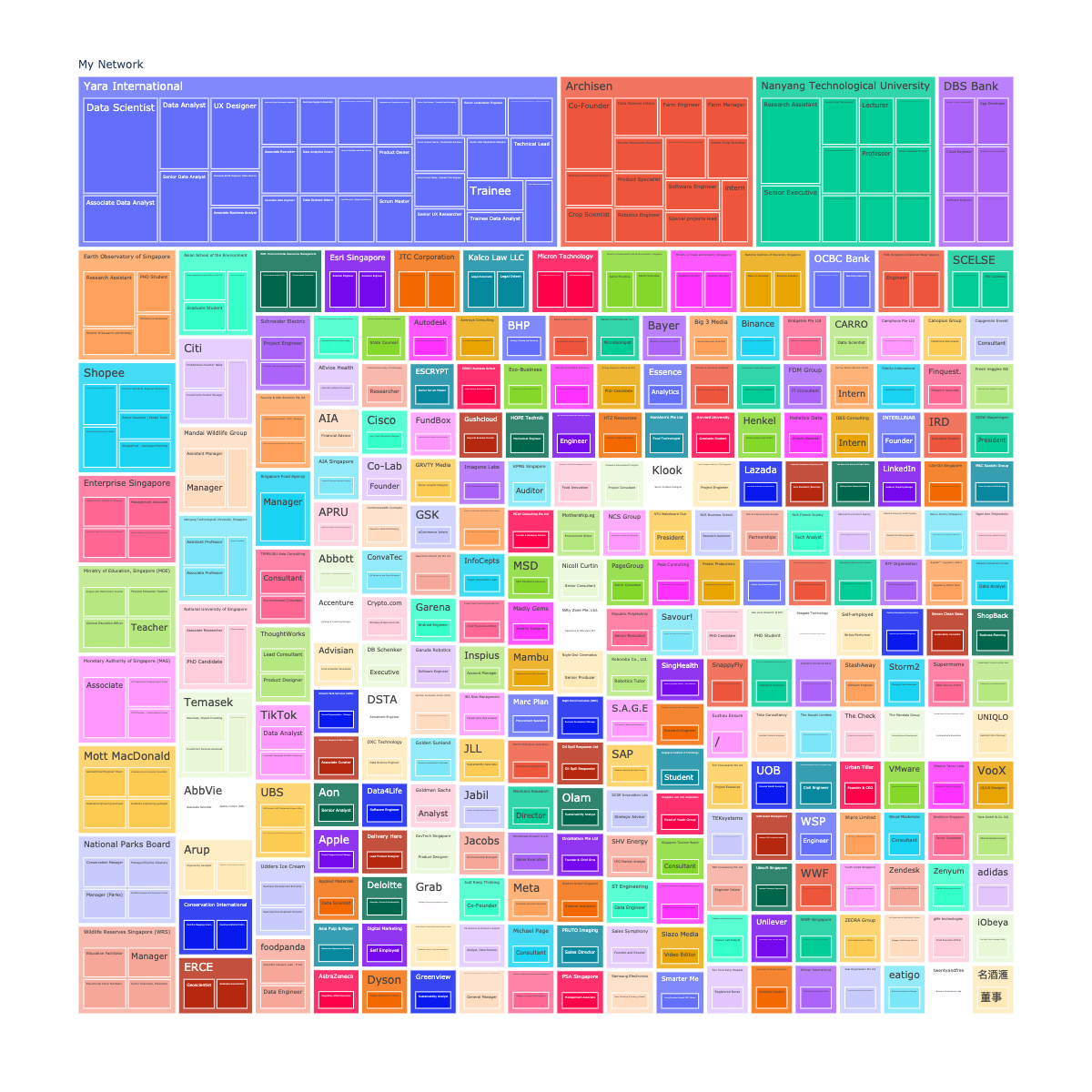
Connections at a glance
new_df1 = new_df[['company','position']]
new_df1['My Network'] = 'My Network'

px.treemap(new_df1, path=['My Network', 'company', 'position'], width=1200, height=1200)
New Connections over time
daily_connections = (new_df
                    .groupby(by=['connected_on']) # group by date
                    .size() # sum up new connections per day
                    .plot() # plot line chart
)
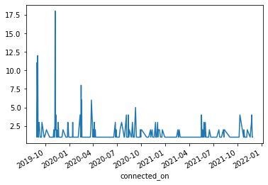
Looking at the number of new connections over time since i joined LinkedIn, bulk of my connections were created during the start - period between end 2019 and start of 2020).
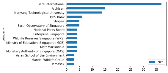
Top 15 companies my connections work at
companies_count = (new_df
                    .groupby(by=['company']) # group by country
                    .size() # sum up count for each company
                    .to_frame('size') # convert to frame
                    .sort_values(by=['size'],ascending=False) # sort by descending order
                    .reset_index()
)
companies_count.head(15).plot(kind='barh').invert_yaxis() # convert to horizontal plot
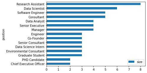
Top 15 roles my connections are working in
position_count = (new_df
                    .groupby(by=['position']) # group by country
                    .size() # sum up count for each company
                    .to_frame('size') # convert to frame
                    .sort_values(by=['size'],ascending=False) # sort by descending order
)
position_count.head(15).plot(kind='barh').invert_yaxis() # convert to horizontal plot
The top 3 companies my connections are working in are from Yara, Archisen and NTU, which is expected given that I did my undergraduate degree in NTU, worked at Archisen after graduation before joining Yara International.
Most of my connections are Research Assistants, Data Scientist and Software Engineers.
Network Analysis
companies_count.reset_index(inplace=True,drop=True)
companies_count_reduced = companies_count.loc[companies_count['size'] >=2]
print(companies_count_reduced.shape)
position_count.reset_index(inplace=True)
position_count_reduced = position_count.loc[position_count['size'] >=2]
print(position_count_reduced.shape)
# Initialise Graph
g1 = nx.Graph()
g1.add_node('root') # initialising myself as centrala node

#
for id,row in companies_count_reduced.iterrows():

    # store company name and count
    company = row['company']
    count = row['size']

    title = f"<b>{company}</b> - {count}"
    # extract the positions my connections hold and store them in a set to prevent duplication
    positions = set([x for x in new_df[company == new_df['company']]['position']])
    positions = ''.join('<li>{}</li>'.format(x) for x in positions)

    position_list = f"<ul>{positions}</ul>"
    hover_info = title + position_list

    g1.add_node(company, size = count*2, title = hover_info, color='#3449eb')
    g1.add_edge('root',company,color='grey')

# Generate the graph
company_nt = net.Network(height='700px', width='700px', bgcolor="grey", font_color='white',notebook=True)
company_nt.from_nx(g1)
company_nt.hrepulsion()

company_nt.show('company_graph.html')
display(HTML('company_graph.html'))
# initialize graph
g2 = nx.Graph()
g2.add_node('root') # intialize yourself as central

# use iterrows tp iterate through the data frame
for id, row in position_count_reduced.iterrows():

  count = f"{row['size']}"
  position= row['position']

  g2.add_node(position, size=count, color='#3449eb', title=count)
  g2.add_edge('root', position, color='grey')

# generate the graph
position_nt = net.Network(height='700px', width='700px', bgcolor="black", font_color='white', notebook = True)
position_nt.from_nx(g2)
position_nt.hrepulsion()

position_nt.show('position_graph.html')
display(HTML('position_graph.html'))