Predicting housing prices in Melbourne through regression analysis. This notebook walks through the full workflow—data cleaning, exploration, and modelling with linear and multiple regression. I also apply feature selection techniques (correlation and mutual information) and evaluate model performance using MAE, MSE, RMSE, and R². This notebook is adapted from Price Analysis and Linear Regression on Kaggle
Melbourne Housing Market
Housing clearance data from Jan 2016
- When did the Melbourne housing cooled off?
- Could you see it slowing down? What were the variables that showed the slowing down (was it overall price, amount sold vs unsold, change in more rentals sold and less housing, changes in which CouncilArea or Region, more houses sold in distances further away from Melbourne CBD and less closer)?
- Could you have predicted it?
- Should I hold off even longer in buying a two bedroom apartment in Northcote??
Some Key Details
Suburb: Suburb
Address: Address
Rooms: Number of rooms
Price: Price in Australian dollars
Method:
S - property sold;
SP - property sold prior;
PI - property passed in;
PN - sold prior not disclosed;
SN - sold not disclosed;
NB - no bid;
VB - vendor bid;
W - withdrawn prior to auction;
SA - sold after auction;
SS - sold after auction price not disclosed.
N/A - price or highest bid not available.
Type:
br - bedroom(s);
h - house,cottage,villa, semi,terrace;
u - unit, duplex;
t - townhouse;
dev site - development site;
o res - other residential.
SellerG: Real Estate Agent
Date: Date sold
Distance: Distance from CBD in Kilometres
Regionname: General Region (West, North West, North, North east …etc)
Propertycount: Number of properties that exist in the suburb.
Bedroom2 : Scraped # of Bedrooms (from different source)
Bathroom: Number of Bathrooms
Car: Number of carspots
Landsize: Land Size in Metres
BuildingArea: Building Size in Metres
YearBuilt: Year the house was built
CouncilArea: Governing council for the area
Lattitude: Self explanitory
Longtitude: Self explanitory
## Import libraries

# Data wrangling
import pandas as pd
import numpy as np
from datetime import date # Usage: Determine days from start

# Data Visualisations
%matplotlib inline
import matplotlib.pyplot as plt
import pylab as pl
import seaborn as sns

# Model Development and Evaluation
from sklearn.model_selection import train_test_split # For Model Development
from sklearn.linear_model import LinearRegression
from sklearn import metrics
# Reading source files

# df_houseprice = pd.read_csv("data/MELBOURNE_HOUSE_PRICES_LESS.csv")
df_housingfull= pd.read_csv("data/Melbourne_housing_FULL.csv")
Linear Regression
Data Cleaning
- Convert arguments in Date column to datetime
- Filter out data that are not housing types
I will only be focusing on housing data.
# Data Cleaning
df_housingfull = df_housingfull.rename(columns={'Lattitude':'Latitude'}) # Rename column names

# Remove unrelevant column data
df_housingfull = df_housingfull.drop(['Suburb', 'Address', 'SellerG','Regionname', 'CouncilArea'],axis=1)

# Convert date column to datetime
df_housingfull['Date'] = pd.to_datetime(df_housingfull['Date'],dayfirst=True)
print("There are {} rows and {} columns in this dataframe" .format(df_housingfull.shape[0],df_housingfull.shape[1]))

# Create new dataframe with only housing data
df = df_housingfull[df_housingfull['Type']=='h']
print("After filtering data that are not housing types, there are {} rows and {} columns in this new dataframe" .format(df.shape[0],df.shape[1]))
There are 34857 rows and 16 columns in this dataframe
After filtering data that are not housing types, there are 23980 rows and 16 columns in this new dataframe
Data Exploration using Visualisations
- Histogram plot for each variable
- Pair plots
- Observe average price change per quarter over the years
# Plot Relationships between price and features
sns.set_style( 'darkgrid' )
fig, axes = plt.subplots(3,2,figsize=[20,20])

# Plot 1: Scatterplot of AVerage Price against Date
mean_df = df.sort_values('Date',ascending=False).groupby('Date').mean().reset_index()
axes[0,0].scatter(x='Date',y='Price',data=mean_df,edgecolor='b' )
axes[0,0].set_xlabel( 'Date' )
axes[0,0].set_ylabel( 'Price' )
axes[0,0].set_title( 'Price vs Date')

# Plot 2: Diagonal Correlation Matrix
# Compute the correlation matrix
corr = df.corr()
# Generate a mask for the upper triangle
mask = np.triu(np.ones_like(corr, dtype=bool))
# Generate a custom diverging colormap
cmap = sns.diverging_palette(230, 20, as_cmap=True)
# # Draw the heatmap with the mask and correct aspect ratio
sns.heatmap(corr, mask=mask, cmap=cmap, center=0,
            square=True, linewidths=.5, cbar_kws={"shrink": .5},ax=axes[0,1])
axes[0,1].set_xlabel('Date')
axes[0,1].set_ylabel('Property Count per Suburb')
axes[0,1].set_title('Property Count vs Date')

# Plot 3: Boxplot of Price against number of Bathrooms
sns.boxplot(x='Bathroom',y='Price',data=df ,ax=axes[1,0] )
axes[1,0].set_xlabel( 'Bathroom' )
axes[1,0].set_ylabel( 'Price' )
axes[1,0].set_title( 'Price vs Bathroom')

# Plot 4: Boxplot of Price against number of Bedrooms
sns.boxplot(x='Bedroom2',y='Price',data=df ,ax=axes[1,1] )
axes[1,1].set_xlabel( 'Bedroom' )
axes[1,1].set_ylabel( 'Price' )
axes[1,1].set_title( 'Price vs Bedroom')

# Plot 5: Regression plot of Average istance against Average Price
sns.regplot(x='Distance',y='Price',data=mean_df,scatter_kws={"color": "black"}, line_kws={"color": "red"},ax=axes[2,0])
axes[2,0].set_xlabel('Distance')
axes[2,0].set_ylabel('Price')
axes[2,0].set_title('Price vs Distance')

# Plot 6: Regression plot of Distance against Price
sns.regplot(x='Distance',y='Price',data=df,scatter_kws={"color": "black"}, line_kws={"color": "red"},ax=axes[2,1])
axes[2,1].set_xlabel('Distance')
axes[2,1].set_ylabel('Price')
axes[2,1].set_title('Price vs Distance')
Text(0.5, 1.0, 'Price vs Distance')
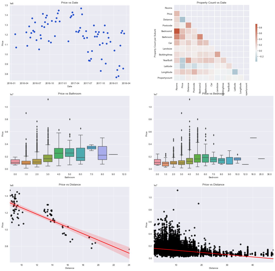
These visualisations can help to answer the first 2 questions:
- The housing prices in Melbourne appears to begin cooling off sometime between April and July in 2017.
- Based on the correlation matrix, the top 2 features that affects pricing is the number of Bathrooms, nunber of Bedrooms and distance (kilometres) from CBD. I plotted boxplots to visualise how price varies the number of bedrooms and bathrooms. The boxplot for the number of bedrooms indicate that there’s quite alot of variability. For distance, I used a regression plot to see how price varies. The plot shows a negative relationship between the two, which is logical since housing near CBD are usually priced higher than those in the outer regions.
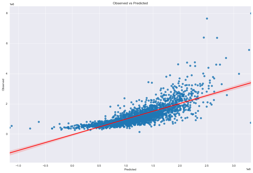
Linear Regression Model with all Features
In this part, I will evaluate the linear regression model using all the available features. The data is split into training and test data with a 2:1 ratio. The coefficient for each predictor variable is subsequently ranked after, showing that longitude, number of bathrooms and the vendor bid method as the top 3 most significant feature in the model.
## Further data cleanup
# Remove missing values
df1 = df.dropna().sort_values('Date')

###########
##Find out days since start
days_since_start = [(x-df1['Date'].min()).days for x in df1['Date']]
df1['Days'] = days_since_start

# Convert Categorical Variables to dummy/indicator variables
df2_dummies = pd.get_dummies(df1[['Type','Method']])
df2 = df1.drop(['Type','Date','Method'],axis=1).join(df2_dummies)

# Determine x (independent variables or predictor variables) and y (dependent variables)
y = df2['Price'] # Price being the dependent variable
x = df2.drop(['Price'],axis=1) # Remove price from the independent variables

# Split into training and test set
x_train, x_test, y_train, y_test = train_test_split(x,y,test_size=0.33)

# Fit the model
model = LinearRegression()
model.fit(x_train,y_train)

# Evalute the model
ypredictions = model.predict(x_test)

# Ranking the coefficients
coeff_df = pd.DataFrame(model.coef_,x.columns,columns=['Coefficient'])
ranked_coeff = coeff_df.sort_values("Coefficient", ascending = False)
print(ranked_coeff)
                Coefficient
Longtitude     5.404310e+05
Bathroom       2.050054e+05
Rooms          8.073899e+04
Car            5.194845e+04
Method_VB      4.878232e+04
Method_S       3.758929e+04
Bedroom2       3.111879e+04
BuildingArea   1.683848e+03
Method_PI      1.355322e+03
Postcode       1.044804e+03
Days           1.491648e+02
Landsize       6.700705e+01
Propertycount  1.272204e+00
Type_h         1.164153e-10
YearBuilt     -3.213159e+03
Method_SP     -3.698939e+04
Method_SA     -5.073755e+04
Distance      -5.161010e+04
Latitude      -1.537221e+06
Scatter Plot of Actual vs Predicted
fig_lm,axes_lm = plt.subplots(1,1,figsize=[15,10]) # Create a custom size figure

# # ax1 = fig_lm.add_subplot() # Add subplot
sns.regplot(x=ypredictions,y=y_test,line_kws={"color":"red"},ax=axes_lm)
axes_lm.set_xlabel("Predicted") # Add x label
axes_lm.set_ylabel("Observed") # Add y label
axes_lm.set_title("Observed vs Predicted")
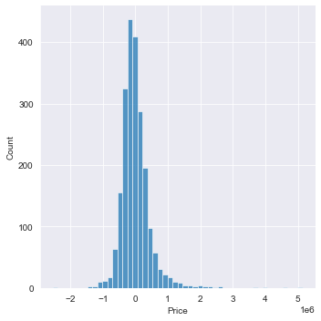
Distribution plot: difference in actual price and predicted price
sns.displot(data=(y_test-ypredictions),bins=50)
Evaluating the Raw Linear Regression model
print("------Evaluated predictions for a raw Linear Regression Model------")
print("MAE: ", metrics.mean_absolute_error(y_test,ypredictions))
print("MSE: ", metrics.mean_squared_error(y_test,ypredictions))
print("RMSE: ", np.sqrt(metrics.mean_squared_error(y_test,ypredictions)))
print("R^2 ", metrics.r2_score(y_test,ypredictions))
------Evaluated predictions for a raw Linear Regression Model------
MAE:  303135.5223904289
MSE:  211634647505.68866
RMSE:  460037.6587907654
R^2  0.5857898755940139
Multiple Regression
Feature Selection
from sklearn.model_selection import RepeatedKFold
from sklearn.model_selection import cross_val_score
from sklearn.feature_selection import f_regression
from sklearn.feature_selection import SelectKBest
from sklearn.feature_selection import mutual_info_regression
from sklearn.pipeline import Pipeline
from numpy import mean
from numpy import std
from matplotlib import pyplot
from sklearn.model_selection import GridSearchCV
This model leverages on the correlation (most common correlation measure being pearsons correlation) to determine which variable is the most relevant.
# Create a function that can implement feature selection for the input training and test data
def select_features_mis(X_train,Y_train, X_test):
    # Configure to select all features
    features = SelectKBest(score_func=mutual_info_regression, k = 16)
    # Learn relationship from training data
    features.fit(X_train,Y_train)
    # Transform training data
    X_train_feats = features.transform(X_train)
    # Transorm test data
    X_test_feats = features.transform(X_test)
    return X_train_feats,X_test_feats,features

# Running the regression model that applies feature selection (mutual information statistics)
# Feature selection
x_train_feats_mis, x_test_feats_mis, features_mis = select_features_mis(x_train,y_train,x_test)

# Scores for the features
for feature in range(len(features_mis.scores_)):
    print('Feature %d: %f' % (feature, features_mis.scores_[feature]))

# Fit the model
model_feats_mis = LinearRegression()
model_feats_mis.fit(x_train_feats_mis,y_train)

# Evaluate the model
ypredictions_feats_mis = model_feats_mis.predict(x_test_feats_mis)
Feature 0: 0.085276
Feature 1: 0.379063
Feature 2: 0.535257
Feature 3: 0.083888
Feature 4: 0.111936
Feature 5: 0.028387
Feature 6: 0.061553
Feature 7: 0.143656
Feature 8: 0.147641
Feature 9: 0.300453
Feature 10: 0.259006
Feature 11: 0.328668
Feature 12: 0.039872
Feature 13: 0.011723
Feature 14: 0.014065
Feature 15: 0.040096
Feature 16: 0.000000
Feature 17: 0.005040
Feature 18: 0.056839
Correlation Statistics
This model leverages on the correlation (most common correlation measure being pearsons correlation) to determine which variable is the most relevant.
# Create a function that can implement feature selection for the input training and test data
def select_features_cs(X_train,Y_train, X_test):
    # Configure to select all features
    features = SelectKBest(score_func=f_regression, k = 16)
    # Learn relationship from training data
    features.fit(X_train,Y_train)
    # Transform training data
    X_train_feats = features.transform(X_train)
    # Transorm test data
    X_test_feats = features.transform(X_test)
    return X_train_feats,X_test_feats,features

# Running the regression model that applies feature selection (correlation statistics)
# Feature selection
x_train_feats_cs, x_test_feats_cs, features_cs = select_features_cs(x_train,y_train,x_test)

# Scores for the features
for feature in range(len(features_cs.scores_)):
    print('Feature %d: %f' % (feature, features_cs.scores_[feature]))

# Create model
model_feats_cs = LinearRegression()
# Fit the model
model_feats_cs.fit(x_train_feats_cs,y_train)
# Evaluate the model
ypredictions_feats_cs = model_feats_cs.predict(x_test_feats_cs)
Feature 0: 624.218533
Feature 1: 831.558520
Feature 2: 1.104028
Feature 3: 559.223771
Feature 4: 1039.871719
Feature 5: 52.724016
Feature 6: 6.962535
Feature 7: 918.872851
Feature 8: 354.376184
Feature 9: 356.552179
Feature 10: 228.442479
Feature 11: 11.192402
Feature 12: 75.345978
Feature 13: nan
Feature 14: 18.467231
Feature 15: 15.835652
Feature 16: 0.421705
Feature 17: 54.838265
Feature 18: 118.419765
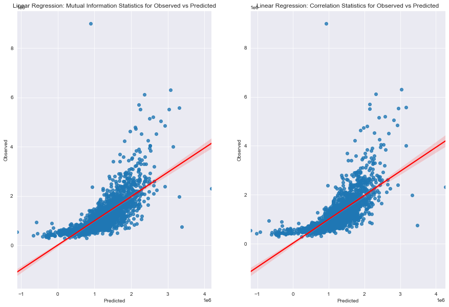
Visualising Regression Models
fig_lm,(axes_lm_mis,axes_lm_cs) = plt.subplots(1,2,figsize=[15,10]) # Create a custom size figure

# Creating plot for Mutual Information Statistics
sns.regplot(x=ypredictions_feats_mis,y=y_test,line_kws={"color":"red"},ax=axes_lm_mis)
axes_lm_mis.set_xlabel("Predicted") # Add x label
axes_lm_mis.set_ylabel("Observed") # Add y label
axes_lm_mis.set_title("Linear Regression: Mutual Information Statistics for Observed vs Predicted")

# Creating plot for Correlation Statistics
sns.regplot(x=ypredictions_feats_cs,y=y_test,line_kws={"color":"red"},ax=axes_lm_cs)
axes_lm_cs.set_xlabel("Predicted") # Add x label
axes_lm_cs.set_ylabel("Observed") # Add y label
axes_lm_cs.set_title("Linear Regression: Correlation Statistics for Observed vs Predicted")
Model Evaluation
print("------Evaluated predictions for a raw Linear Regression Model------")
print("MAE: ", metrics.mean_absolute_error(y_test,ypredictions))
print("MSE: ", metrics.mean_squared_error(y_test,ypredictions))
print("RMSE: ", np.sqrt(metrics.mean_squared_error(y_test,ypredictions)))
print("R^2: ", metrics.r2_score(y_test,ypredictions))

print("------Evaluated predictions for a Linear Regression Model with Correlation Statistics Feature Selection------")
print("MAE: ", metrics.mean_absolute_error(y_test,ypredictions_feats_cs))
print("MSE: ", metrics.mean_squared_error(y_test,ypredictions_feats_cs))
print("RMSE: ", np.sqrt(metrics.mean_squared_error(y_test,ypredictions_feats_cs)))
print("R^2: ", metrics.r2_score(y_test,ypredictions_feats_cs))

print("------Evaluated predictions for a Linear Regression Model with Mutual Information Statistics Feature Selection------")
print("MAE: ", metrics.mean_absolute_error(y_test,ypredictions_feats_mis))
print("MSE: ", metrics.mean_squared_error(y_test,ypredictions_feats_mis))
print("RMSE: ", np.sqrt(metrics.mean_squared_error(y_test,ypredictions_feats_mis)))
print("R^2: ", metrics.r2_score(y_test,ypredictions_feats_mis))
------Evaluated predictions for a raw Linear Regression Model------
MAE:  301077.07816341706
MSE:  235171170575.45062
RMSE:  484944.50257266616
R^2:  0.5415862801118618
------Evaluated predictions for a Linear Regression Model with Correlation Statistics Feature Selection------
MAE:  309316.00912912446
MSE:  246586130384.74255
RMSE:  496574.39561937
R^2:  0.5193353631489246
------Evaluated predictions for a Linear Regression Model with Mutual Information Statistics Feature Selection------
MAE:  301072.41752915125
MSE:  235167756102.42468
RMSE:  484940.9820817629
R^2:  0.541592935865105
By applying two types of feature selection techniques and comparing the models, the metrics indicate that mutual information statistics allow us to to achieve a more accurate model - higher R^2 and lower error metrics (MAE, MSE and RMSE).